Beyond the Corporate Blueprint: Why I Just Rebranded to Shadow & Slate
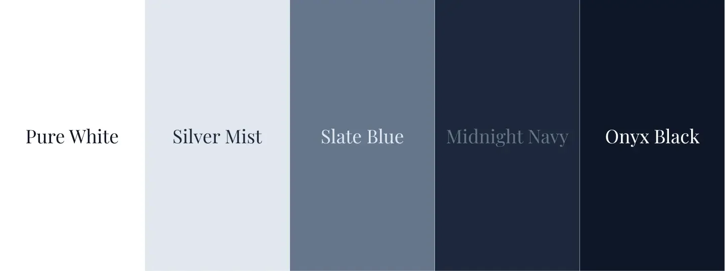
The Evolution of the Blueprint: Why I Just Reset My Brand Colors
If you’ve been following Zdarko Photography for a while, you’ve seen a lot of "Corporate Sky Blue." It was safe. It was professional. It was comfortable.
But as my work evolved from standard headshots into high-end editorial branding and cinematic "Noir" storytelling, the sky-blue didn't feel right anymore. It felt like an IT Knowledge Base from 2012, not a high-authority creative agency.
So, I hit the reset button. Here is the strategy behind the new Shadow & Slate palette.
1. Authenticity You Can See (Literally)
I’ll give you the "behind-the-lens" truth: Being colorblind makes the world look a little different to me. Blue is one of the few colors I see with absolute clarity.
Leaning into this new palette isn't just a design choice; it’s an authentic choice. By focusing on Slate, Midnight, and Onyx, I’m building my brand on a foundation of colors I trust. If I’m going to guide your visual identity, I have to be 100% confident in the colors I’m standing behind.
2. Beyond the "Sepia Filter" Trend
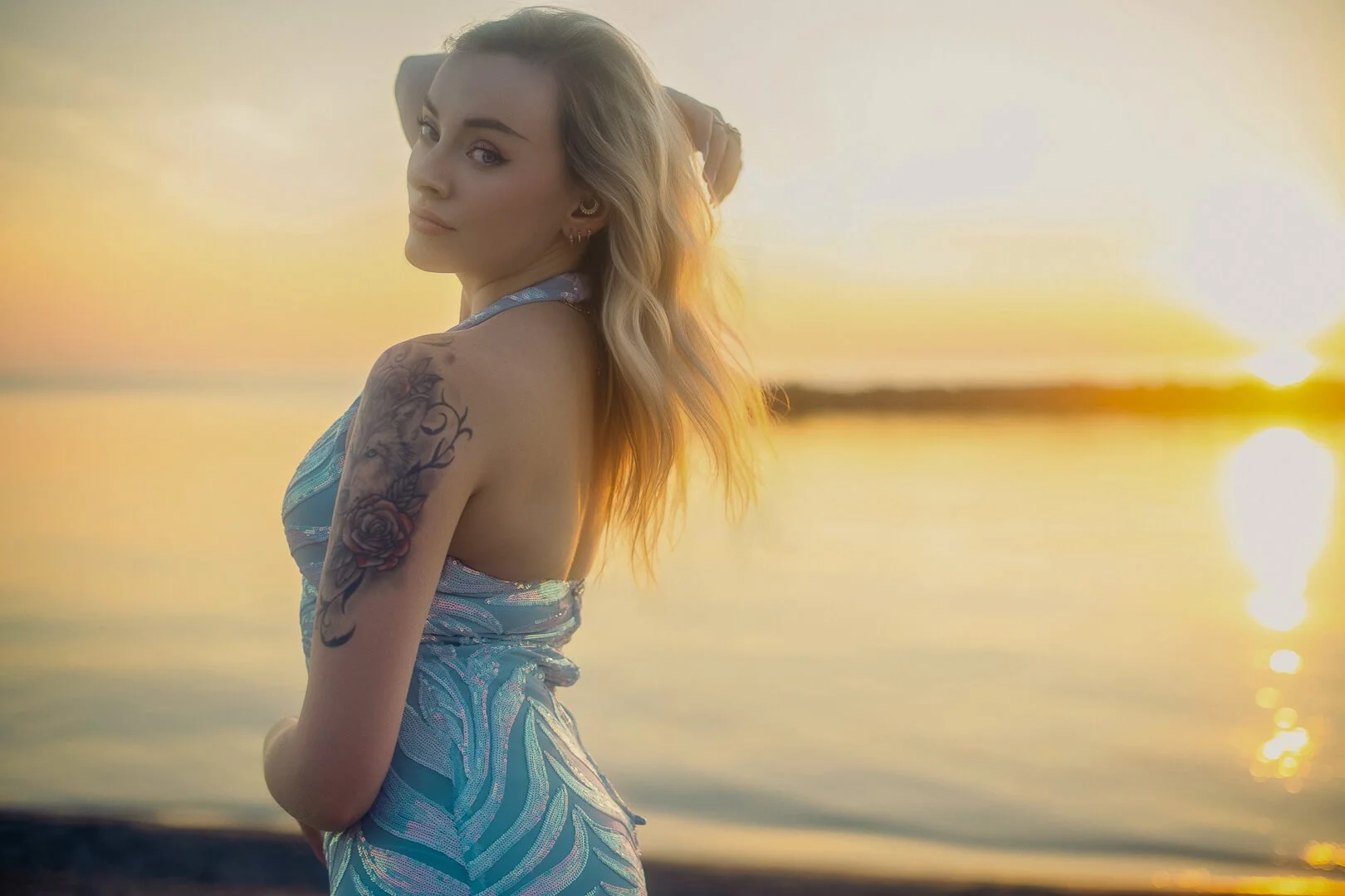
Look around the photography world and you’ll see a very specific trend: "Boho Brown." It’s a style where everything, from the grass to the skin tones, is flattened into a warm, sepia-toned world.
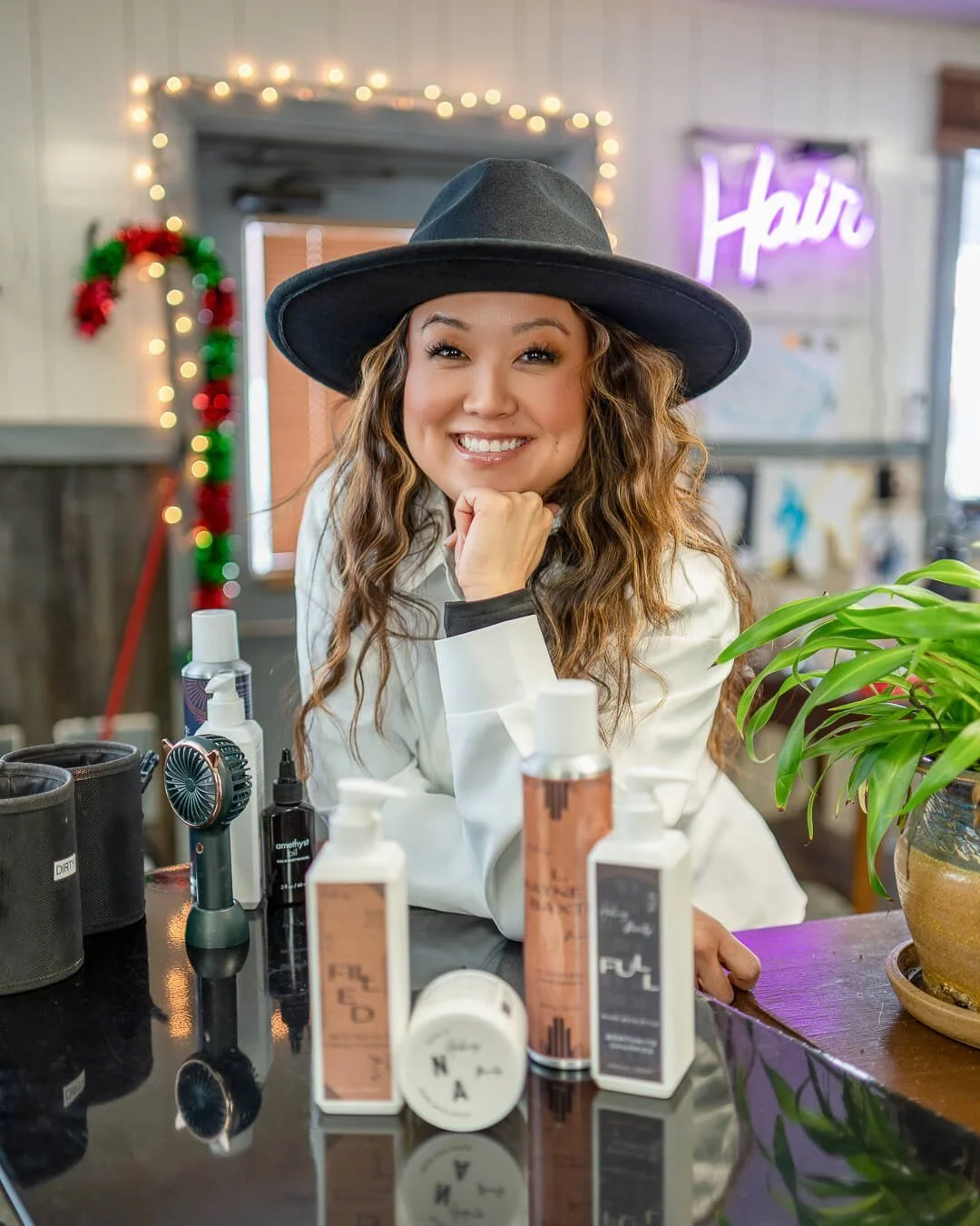
I’ll be honest: I’ve delivered that look. I’m a technician first, and if a client’s vision requires a "warm world" alignment, I have the gear and the skill to make it happen. I love my clients, and I love proving that I can adapt to any request.
These usually look best for family-shoots, and some very specific “Summer Sunset Boho” themes weaved into beauty portraits. There is a very specific space for these, and I am betting it’s not your brand.
But for Zdarko Photography, the goal is different. > My brand is built on dimension, depth, and reality. When you’re building a business identity, you don't want a filter that hides the world; you want a lens that captures it in 61-megapixel detail. By stepping away from the "all-brown" trend and leaning into Shadow & Slate, I’m choosing to showcase your brand with the contrast, clarity, and authentic colors it deserves.
3. The "Gallery" Framework
My primary goal as a brand photographer is to make your brand colors pop. Whether you already have established colors for your brand, or are a part of a larger corporation, or maybe you need to “find your colors” - reach out and let’s see how we can create your brand’s story, while keeping your stunning hero images on point and fit seamlessly into your existing marketing.
For me, the move to Onyx Black and Slate Blue creates a "Gallery" effect. These tones act as a sophisticated frame, allowing the 61-megapixel detail of your images to be the hero of the story.
4. From Service Provider to Creative Director
The "Sky Blue" was for the guy who wanted to be hired. Shadow & Slate is for the Director who has a plan.
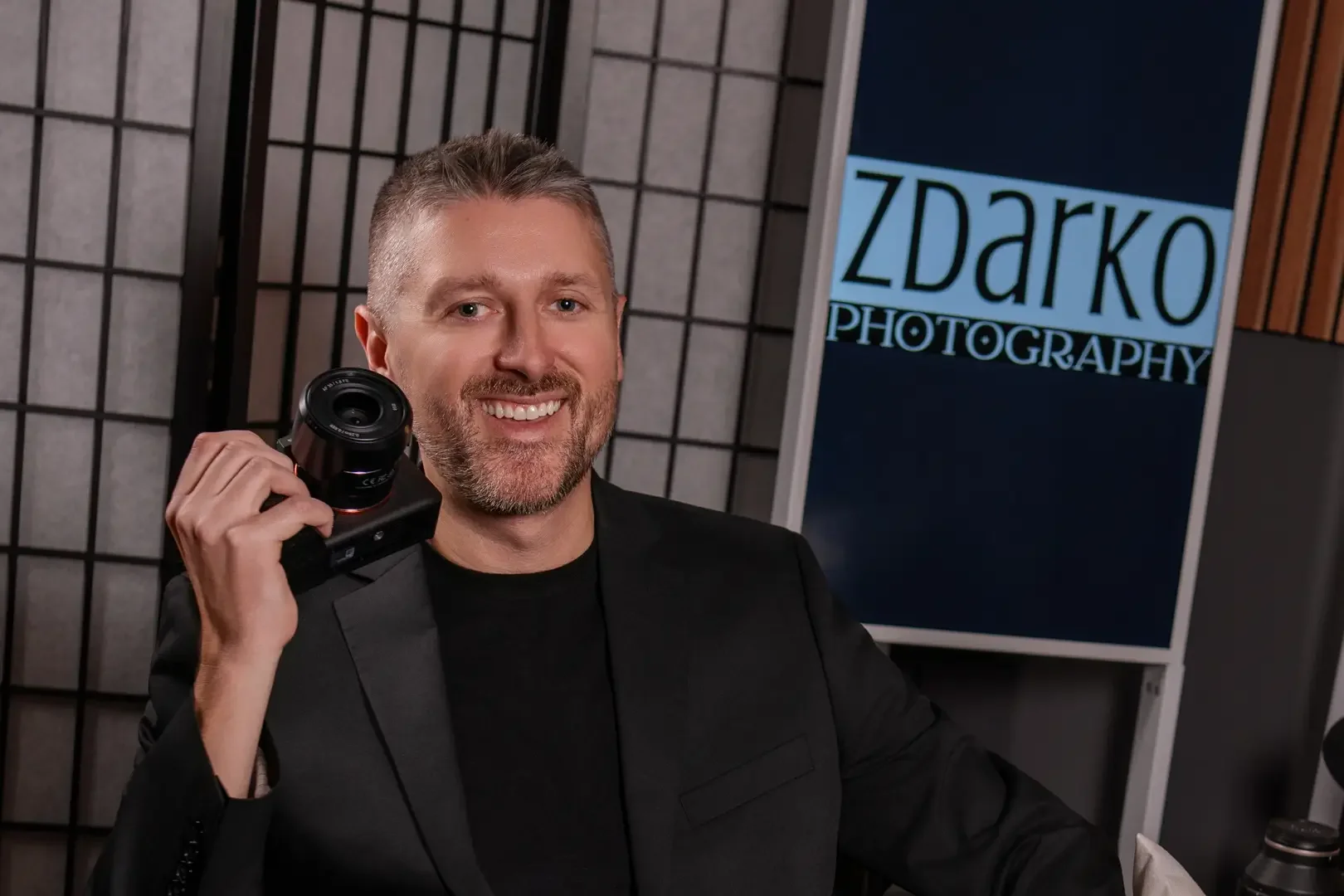
When you walk into a session with me, you’re stepping into the Signature Blueprint™. That process is about strategy, confidence, and authority. I needed a brand identity that looked as sharp as the Sigma Art glass I’m pointing at you.
The Bottom Line?
The gear changed (A7Rv, I see you). The process changed (The Success Portal is live). Now, the brand finally matches the output.
I’m not just taking your photo; I’m building a visual identity that feels like it has a million-dollar budget behind it.